I really looked forward to designing our websites throughout the entire semester and I couldn’t wait to get started on it. The construction of the site was so painless and actually quite enjoyable. I came from working with HTML codes on myspace which allowed me to navigate throughout the process smoothly. Adobe DreamWeaver was so user friendly and really made this procedure that much more effortless, it was my first time working with DreamWeaver and my overall experience was surely a positive one. Throughout the semester we've worked with almost all of the Adobe Creative Suite and most of the applications we're extremely user friendly and beneficial.
I was able to work on my own right away once I was introduced to the software because it is very easy to manage. My favorite element of DreamWeaver was the 'split view' option which allowed us to work and view our progress at the same time, this made working with the HTML codes a bit less confusing because we were able to highlight the exact section we wanted to work on at that time.
Social media plays a major role in our websites because it is another outlet for marketing, I included my blogger account which features several blogs regarding different topics we discussed throughout the semester. Including my blogger account allows the viewer to learn more information about me that is not included on my website and take a closer look. Other students included their professional Facebook and Twitter accounts which is another great way to network and market because these social media accounts feature more personal information and photographs which wouldn’t be found on the website. These days social media accounts are necessary for the promotion of yourself or your business so not including this information would make our websites appear to be outdated, keeping things like this updated allows for better responses. Not only is social media a great way to network it also allows for another outlet of communication, along with the internet email and phone number we included.
Overall these websites provide great personal promotion even without including social media, on my website I included a brief personal biography about myself in third person. As far as my portfolio I decided to include several pieces of my work including fliers, posters and brochures - I also included personal projects such as my resume, business card and logo which is a great way to promote myself and my work. Including these personal documents allows you to promote yourself and whatever business you’re trying to build, I thought it was very important that I included my resume for anyone that may be interested.
Although we’ve covered several different topics throughout the semester I enjoyed the construction of the website the most, I felt like it was an entirely new learning experience and allowed me to get familiar with the HTML code family once again. It was very rewarding to see the final product of the website once it was completed.
Monday, December 21, 2015
Tuesday, December 1, 2015
Loco For Logos
The Inspiration:
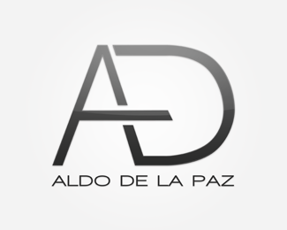
The simplicity of this design is what allows for its greatness, the sleekness of the art gives it personality. The way the A & D comes together allows for a creative element, while staying serious.
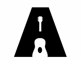
This design is very well done, the imagery of the guitar allows for a more playful take on the art however the bold, black A allows for seriousness and power! Fun & Powerful!

Less is MORE!!!!! This logo looks powerful, trustworthy and serious all in one letter. The slash of white gives it the pop of creativity it needed without taking away from the credibility away from the design.
Very well played, the name is powerful and attracts the eyes of the viewer right to the image, however in the left hand corner is another mini logo which appears to be a T & M also possibly reading out the word "He" to represent authority.
Playful and powerful, the two most important elements of almost every logo. The splash of lime green gives it personality along with the the name "Lindsay" which appears to be handwritten, great for a personal logo and self promotion!
The Poor Lil' Rich Girl:
This Buffalo based company is named 'Poor Lil Rich Girl' for the rich girl living in the hearts of every girl on a budget; here is where we offer one of a kind hand picked vintage pieces for an affordable price. The target audience of this company is women of all ages with a passion for good fashion, in the future we hope to expand to mens clothing as well. The ideal of the brand is finding glamorous thrifted clothing and giving it new life and a new owner. The logo embodies this goal by using a super cute button and surrounding it with the recycle symbol, the logo is playful, fun and most importantly ELEGANT! Stay tuned...
Thursday, November 19, 2015
Simplicity and Clarity
Follow The Yellow Brick Road:
Found on the cover
is the same yellow mentioned earlier, it is used as a highlighted background
for the title or name of the company and was done very well. The yellow is
placed very strategically behind only a half of the title, which doesn’t
overwhelm the reader with brightness but instead gives it that pop of radiance
that it needs. Also featured on the cover page are some images of architect, this
is believed to be the focal point of the brochure. The imagery on the cover
page is very stylistically simple yet still very elegant, these images range in
different tones of cool greys, blacks and whites keeping with the ‘toned down’
theme. The cover page is very straightforward, it features a crispy bright grey
background that the artist used allows the design hierarchy of the page to be
the title backed by the beautiful bright yellow color behind it, which is of
course the most important element of the page.
Moving on to the
inside of the brochure is where you will find the important information the
business decided to feature which is very subtle. You find a text block on the
bottom half of the first page and that’s pretty much it. The body copy is not
much longer than a traditional paragraph keeping it short and simple for the
reader and that is always ideal in a brochure. You can also see that the
designer features the beautiful yellow color again to the left of the page,
keeping it interesting to the reader because most people will flip right by a
boring page full of text if there is no emphasis. The final page of the
brochure is focused more on imagery and that was very well played by the
designer; it ties in the final idea of the brochure leaving you with the impact
the image leaves on you and very minimal text.
This brochure was
designed very well, with beautiful repetition of the color schemes and images
used; the overall success of this design is defined by the effortlessness of
its work - less is ALWAYS more!

Bursting With Excitement:
This brochure
is a traditional trifold, this allows for more room than the first brochure
that we focused on and that can work out to be a good or a bad thing for the
designer and the reader. The cover page
of this project is very well done, you have your design hierarchy which focuses
on the main idea of the brochure which is social media strategies. The design element on the cover isn’t bad. The
artist used imagery to represent different social media icons making it more
playful and inviting to the reader, they also featured a very straightforward
typeface keeping it structured. You may also notice that the designer used a
color scheme that may be familiar to some of the readers, the colors can be
related to those used on twitter, a popular social media domain which also adds
to the creative elements of the design.
On the inside
is where things get a little sticky you open up the brochure to quite a bit of
information and it is placed allover. The first page isn’t horrible because you
are guided with sub-headers making it easier to breakdown the information which
keeps it cleaner but going forward isn’t so simple. The next two pages of the
brochure appear to be a bit overcrowded and extremely heavy with information.
The statistics were cool and the designer used them in a fun way but with all
of the other information it can get very distracting to the readers.
Also adding to
the heavy load of information is the graphics used, there actually isn’t that
much body copy in the document however the graphics make it appear to be more
abundant and overpopulated.
This brochure has the potential to be
something great but the text should be more organized and the graphics should
be toned down just a notch… The designer could have possibly dedicated half a
page to text and the other half to graphics and the included the statistics
chart this would give more breathing room and make it appear less intimidating
to the reader – less is ALWAYS more!

Tuesday, November 3, 2015
Sending My Love
I was extremely excited for the postcard project because I was thrilled to be able to use one of my own photos for a project, I couldn't wait to see how it would turn out and get started on it. My main objective for the postcard was to make it extremely simple, I wanted it to be informative so I felt that the text should be the most important element of the card opposed to images and design. The more I thought about the layout of the design I knew that I wanted it to be something that related well to my personality and had an elegant touch to it as well.. So for that I took to everyone's favorite search engine, google - here I found numerous lace backgrounds which I loved because of the colors, simplicity and I felt it would give the design great texture.
So here we are, I have decided on my photo and background.. Next that left me with color and text style which was actually still part of the fun stuff, I decided to correlate my entire background to the lace color scheme which was black and different hues of grays, so I decided to stay with black to keep it simple and toned down, I also feel like these colors communicate me quite well because they're powerful yet still a bit mysterious. For text style I wanted something that was elegant and simple, also keeping with the lace theme I had going on so I decided on something more fancy for the fonts an almost cursive, yet neater text for the body - and for my header which was my name I downloaded a custom font from an online website which I absolutely adored and I felt it went with the theme very well, it was loose and swirly. I really wanted to go with something more elaborate as far as the font was concerned because I didn't want to overload with design and as I mentioned above I wanted the text to do the talking, literally. Plus I'm a quite elaborate individual myself so I thought what better way to communicate that L-O-L!
For the design hierarchy I wanted it to be simple like the rest of the project, and I decided that my name was the most important piece of information, however looking back now I wish that I would have maybe used initials instead - something a bit more creative. My design hierarchy didn't quite turn out exactly as I wanted to because I ran out of space and I didn't want to make it huge and crowd the entire project so I decided to keep it toned down, it is still one of the first thing the eye grabs however not quite as powerful as I would have liked it to be.
When it came to putting everything into action in the Adobe Creative Suite it was actually quite painless. It is actually very fascinating to see your work in other applications and how easily something can be imported to the next program. The most tedious part of the entire assignment for me was the text wrap, I'm not quite sure if I was doing something wrong or if my image file was corrupted but the text wrap would not work together with my image, and I struggled for hours trying to solve the issue so eventually I found a way to make it work however the text isn't as close to the image as I wish that it would have been, I won't complain though. I really enjoyed learning how to silhouette images in Photoshop, its such a cool tool and I can certainly see myself using it in the future for personal projects.
Although this project got quite tricky at times it was an overall great learning experience seeing how well all of these programs can work together and how there are things you can do in one place and things that just aren't achievable in others. I used Indesign as my home base for the project and this is where I imported everything to, I also used indesign for my text and fonts. Photoshop came in handy for the image, here is where I silhouetted,edited and made any other necessary changes to the image and Illustrator is where I brought the background in and built it up, and how I created my own shapes which I wanted to correlate with the background and it turned out nicely. I would say this project was very helpful because going forward i'm certain that using all of the suites together will be necessary especially for the website that we will build. I also think that this knowledge will be helpful for our upcoming brochure project.

Tuesday, October 13, 2015
Race and Relationships
Research:
Throughout history interracial couples have suffered traumatic experiences regarding their choice to date someone outside of their own ethnicity, this has been an ongoing problem for hundreds of years and still cause turmoil in our society today. In 1967 congress passed a law making it legal for interracial couples to marry, although this still wouldn't stop most people from denying and shaming the idea of interracial marriage it would make it legal.Despite the objection of many people interracial relations are amongst us and showing a sign of rapid growth, 'looking beyond newlyweds, 6.3% of all marriages were between spouses of different races in 2013, up from less than 1% in 1970' (PewResearch). Although interracial marriages are on the rise, the negative biases surrounding them are still prevalent in society today, despite the the opposition from American's interracial relationships do have hope. 'As more interracial couples marry and have children, the stigmas associated with such relationships will gradually fade away.' predicted Daniel Lichter, a sociology professor. "Mixed-race children have blurred America's color line. They often interact with others on either side of the racial divide and frequently serve as brokers between friends and family members of different racial backgrounds," said Lichter (NationalDesertNews).
"But America still has a long way to go." (NationalDesertNews)
Interracial relationships is known today as a social problem which affects thousands of relationships daily. Although it was once a serious political problem in the United States, it advanced passed those days but still has much more acceptance to gain throughout our community. 'According to the poll, 87% of Americans now approve of marriages between black and white partners, compared to 4% of Americans in 1958.' (MIC) Although these numbers do show signs of improvements, its still not quite 100%. 'The most conservative of opponents argue, "marriage should be between a man and a woman who share the same upbringing, skin color and cultural background. But you know what? We're not buying it. Love should be colorblind and gender blind."' (YourTango).
My stance on the situation is as simple as it gets, LOVE WINS! I am all in favor for the happiness of any individual, these choices of others do not directly affect myself or wellbeing so i'm in no position to disapprove. All in favor for bi-racial babies, please rise!
Design Statement:
Imagery-
For imagery I would like to create something stylish, yet still simple enough to represent the bigger picture here which is LOVE! I researched several different ways to creatively design elegant hearts that represent the focal point, this idea can be found HERE. I also found cute characters pictures on their wedding day, I thought they would be great to incorporate in, I would make the characters two different ethnicities however this vision may be a bit to advanced for me, click HERE to view the design. I also decided I would take several original photos of my family members who happen to be an interracial couple, in these photos I had the couple place their hands together showing off their wedding ring as a symbol of unity, these photos will be used as a backup.
Adjectives-
- beautiful
- blind
- brave
- different
- flawless
- true
- genuine
- harmless
- united
- admirable
Typeface-
I did not want to overload on fonts because I plan on relying a lot on imagery to play a big part of the design element. I do wish to achieve a clean, crisp and classic look with the typeface, because my topic is something that has been a conflict for such a long time I wanted to use text that appeared to be more modern to represent the growth it has experienced. After reading the article suggested to us on fonts I realized the importance of text in a design. Although I always knew it was important, It has more impact than one could possibly imagine. I browsed for several different styles of typeface to fit the characteristics that I was searching for and narrowed it down to two:
- Blunt
- Another Shabby
I decided on these two fonts because they both embodied the style I am looking for, I will use the blunt typeface style for the areas that have information and need to be clearly understood. Another Shabby typeface will come in to play for the more artistic elements of type, possibly my poster's headline to create more of a carefree and loving type of feel.
Theme:
The theme I would like to achieve is clean and weightless, I would like to depict an image that is crisp, bright and elegant. I want it to be bright and refreshing. The colors I want to use are symbolic of the topic. I want to use an elegant red to of course to symbolize love and also the suffering that these couples have tolerated because of their choices. The second color I want to incorporate into the design is an ivory, or light beige I feel that this color is crisp but it also to represent the color of human pigmentation, of course people come in all shapes and colors I feel this color is quite diverse. I plan on using grey as a backup color in place of the ivory if it doesn't work well with the design. I found several helpful poster designs HERE that helped me think of a theme.
Tuesday, October 6, 2015
The Good, The Bad and Ugly!!
The Good:

This poster design was highly creative, the playfulness of the text really gave it a great vibe and made it very clear as to what the product on hand was. CocaCola incorporated the signature 'CocaCola' text in such a strong manner and the idea of it being soda added such a great touch of originality. The colors that were used throughout the poster also added to the greatness of the image, the brand kept it simple with the colors they decided to use; keeping it classic with the signature CocaCola red and of course using different shades of browns to add effects to the soda feature of the image. The white canvas also helped promote the simplicity of this design without making it boring, or washed out. Of course the man jumping around in the background could've stayed in his seat, but he too added to the 'playful' vibe the poster was giving off. Lastly, CocaCola finished off the image with a simple old school glass bottle of cola in the right hand corner keeping it classic, along with 'open happiness' their now branded slogan, which also ties in 'flying man' because he looks quite happy. The image design was amazing and got the message across in a creative way; drink a Coke and enjoy life - as simple as that. Well played Coke, very well played!

This poster for jam is absolutely adorable, and very playful. The text the company decided to use really added to the elements of the design. Although the designer decided to play it safe and keep it simple it benefited the overall turnout of the image, less is always more. The colors used for the text however did spice up the vibes in the poster, bright colors were used throughout the image and it really added to the 'easy like Sunday morning' energy it was trying giving off. The most captivating element of the entire image is the plate, it is so creative and really completed the design. It depicts a beautiful summer morning completed with sunshine, sun rays, a garden, butterflies, clouds and even your favorite breakfast in the shape of a fruit which happens to be a mango. This design is one of the most creative and really did a great job incorporating its product into the image. Jam isn't always one of the most desirable breakfasts' for a child however this playful ad might open up children's mind to want to try this yummy breakfast spread. Have breakfast with us and your day will follow up to be a great one, job well done!


This image incorporated text in such a cool way, it is an ad for Burger King which is quite impressive. The BK logo hidden there in the shadows really added to the great designs of the image, along with featuring a burger and a wrap showing that their menu is now more diverse than ever. The image features several different languages which also add to the creative factor and diversity of the design. The colors used in this image were very subtle yet sent the message across very well, keep it simple and keep it cute, GO BK! ;)

This image is so elegant and beautiful, the swan design is very creative and the eye in the center of the swan leads to some type of mystery in this case its a great thing because it is believed to be a movie poster a community in which mystery is very much welcomed. The colors were very well played, a black, red, grey and white also adds to the seriousness of the image and makes you wonder who could have been murdered. The colors were used in a creative gradient element which added to the creativity of the design. The text used was simple and swift adding to the gracefulness of the swan featured above.
The Bad and Ugly:

This poster can use some work, it is extremely difficult to read and once one finally focuses their eyes in on what it actually said the message throws you for a loop and goes against the entire theme of the image. Initially it appears to be a poster for maybe drinking and driving or perhaps a missed eye doctors appointment? However this image actually is a Valentine's Day poster, aside from the awkwardly placed red flower in the corner and the almost impossible to read message it gives no idea of the holiday. Of course keeping it simple in most designs adds to the greatness of it, this image missed that concept its one point was to send off a message and it struggled to complete that. As mentioned the red flower above is the only real added touch of color which also related to a doctors appointment. The message actually reads "You are the jelly to my peanut butter" which is really actually is cute, to incorporate this message in a more holiday oriented manner one could have used more color, better text placement and perhaps a jar of either peanut butter or jelly? This image appears to be an overall nightmare and reminded me to make a doctors appointment before the new year.

This Heineken poster is straight to the point and very well designed.The vibrancy of the colors with the contrasts of the very black background brings out the infamous lime green and really captures the eye. However there was a downfall to this image, nothing was mentioned about it being an 'adult' beverage. Any child flipping through a simple sports illustrated magazine could've stopped at it and gained interests in it, making it look like a Mt. Dew ad. It is important when selling an object to make sure that objective is clear and clean-cut. Of course any beer drinker would be familiar with the green bottle, most people wouldn't realize what type of beverage it is until they went to purchase it. The text simply reads 'Freshness has a name' which would also add to the idea that it could be any type of refreshment, the colors really bring me back to a Mt. Dew ad. A simple 21+, or drink responsibly would add volumes to the image, and clarify exactly what the product being promoted is. As mentioned, this design was done very well along with the colors however the vague information added into the poster actually hurt the design. In this case, and very, very few others LESS IS NOT MORE!! Underage drinking is already a problem, we don't need to make it worse!

The poster doesn't appear to be in english, however it was interesting enough to study it anyways due to the intensity of the image. You are initially bombarded with a text overload, the image is using a Scientific Fantasy (SCFY) themed approach which must tie into the movie script someway however appears to be overused in the design. There are more than 4 different text styles used in the image and it makes it difficult to read, the eye can't focus in on the important elements of the poster because there are so many words jumping out at you. TEXT OVERLOAD! The colors used were a bit more subtle and that toned it down a bit and allowed for it to appear more creative, yet the images placed every where throughout the entire poster only adds to the text overload and makes this poster appear extremely heavy, crowded and immature. With a few minor changes the image could be a great piece of art, yet one can only help but to imagine how intense the film would actually work out to be if the creators felt that this poster did the movie any justice. Of course this is appears to be a science fiction movie so do any rules really apply!?

This design is very fun and playful and would do justice calling out a crowd for a night of fun, or 'boogie woogie' yet is a bit crowded and too 'cartoony' to be taken serious. If it were a design for a high school home coming maybe, but the text is so intense that its not clear as to what event is being promoted.

Although the color scheme is beautiful it is a bit too much and makes it appear a bit immature, the text structure is clean and clear however this poster could use some added elements to spice it up. It almost appears as if a teenaged girl got ahold of Photoshop to create her Sweet-16 birthday bash flier.
Beauty is in the eye of the beholder but a bad design can be spotted by almost anyone. The designs here are very creative and speak for themselves where some could use minor work which could be as simple as placement or font type. When designing the number one rule to remember is LESS IS ALWAYS MORE!
Thursday, September 3, 2015
How To Visually Communicate:
When thinking about communication one knows that there are many forms, and several ways that something can be communicated. Some say things can be communicated verbally, non-verbally and visually as long as a message is being sent and received it can be considered a form of "communication." The most diligent form of communication is verbal, telling someone what you mean is powerful and you can add emphasis to the message by changing the tone of your voice or your delivery. My mother for example uses a certain tone of voice with me which lets me know I'm in deep trouble and that she means business.
Visual communication is a very intriguing thing, its amazing that you can send such an impactful message without saying a word. A few important elements to visual communication is for certain color, the schemes can change the entire mood of the message for example bright colors suggest happiness while darker colors suggest sadness or depression. I believe that color is a key element to visually communicating, however if the message is in black and white it makes it more difficult to focus on color so one should then focus on other important elements such as images and what they are reading.
Apple is a great company for visual communication, all of their products are produced to be user-friendly and sleek. The release of the IPhone C really changed the game for Apple, they now featured products in bright colors such as yellow, pink, blue and green. Up until that point the company only carried their products in the traditional silver, grey and gold. Apple is genius when it comes to marketing and designing, keeping it user-friendly allows for their products to attract consumers of all different walks of life.
Christian Louboutin is A European based shoe designer who is known for his brilliant designs and bright color red bottoms on the soles of his shoes, I believe that Christian's vision of the red bottom shoe is what gave his business such global success along with their beautiful designs. One can recognize a pair of Louboutin's by simply seeing the bright red soles on the back of the heel, to me this is impactful because everyone would then associate those beautiful shoes to the name 'Christian Louboutin'.
Lastly I would like to mention the infamous Kim Kardashian who is known visually for her curvy frame, good looks and amazing style. From the start Kim's career has been driven by her visual appearance while everything else has come second. This does have its positive's because it has made her extremely successful however is constantly scrutinized for being a 'sex symbol' who has no talentless.
Perception is key to communication, how one perceives something is the deciding factor of how much impact the message will have on them. When verbally communicating it is extremely important that perception is the number one element in mind in order to assure impact and importance.
Subscribe to:
Comments (Atom)