Tuesday, October 13, 2015

Race and Relationships

Research:

Throughout history interracial couples have suffered traumatic experiences regarding their choice to date someone outside of their own ethnicity, this has been an ongoing problem for hundreds of years and still cause turmoil in our society today. In 1967 congress passed a law making it legal for interracial couples to marry, although this still wouldn't stop most people from denying and shaming the idea of interracial marriage it would make it legal.
Despite the objection of many people interracial relations are amongst us and showing a sign of rapid growth, 'looking beyond newlyweds, 6.3% of all marriages were between spouses of different races in 2013, up from less than 1% in 1970' (PewResearch). Although interracial marriages are on the rise, the negative biases surrounding them are still prevalent in society today, despite the the opposition from American's interracial relationships do have hope. 'As more interracial couples marry and have children, the stigmas associated with such relationships will gradually fade away.' predicted Daniel Lichter, a sociology professor. "Mixed-race children have blurred America's color line. They often interact with others on either side of the racial divide and frequently serve as brokers between friends and family members of different racial backgrounds," said Lichter (NationalDesertNews).

"But America still has a long way to go." (NationalDesertNews)

Interracial relationships is known today as a social problem which affects thousands of relationships daily. Although it was once a serious political problem in the United States, it advanced passed those days but still has much more acceptance to gain throughout our community. 'According to the poll, 87% of Americans now approve of marriages between black and white partners, compared to 4% of Americans in 1958.' (MIC) Although these numbers do show signs of improvements, its still not quite 100%. 'The most conservative of opponents argue, "marriage should be between a man and a woman who share the same upbringing, skin color and cultural background. But you know what? We're not buying it. Love should be colorblind and gender blind."' (YourTango).


My stance on the situation is as simple as it gets, LOVE WINS! I am all in favor for the happiness of any individual, these choices of others do not directly affect myself or wellbeing so i'm in no position to disapprove. All in favor for bi-racial babies, please rise!

Design Statement:

Imagery-

For imagery I would like to create something stylish, yet still simple enough to represent the bigger picture here which is LOVE! I researched several different ways to creatively design elegant hearts that represent the focal point, this idea can be found HERE.  I also found cute characters pictures on their wedding day, I thought they would be great to incorporate in, I would make the characters two different ethnicities however this vision may be a bit to advanced for me, click HERE to view the design. I also decided I would take several original photos of my family members who happen to be an interracial couple, in these photos I had the couple place their hands together showing off their wedding ring as a symbol of unity, these photos will be used as a backup. 

Adjectives-  
  1. beautiful 
  2. blind
  3. brave
  4. different
  5. flawless 
  6. true
  7. genuine
  8. harmless
  9. united
  10. admirable 
Typeface- 

did not want to overload on fonts because I plan on relying a lot on imagery to play a big part of the design element. I do wish to achieve a clean, crisp and classic look with the typeface, because my topic is something that has been a conflict for such a long time I wanted to use text that appeared to be more modern to represent the growth it has experienced. After reading the article suggested to us on fonts I realized the importance of text in a design. Although I always knew it was important, It has more impact than one could possibly imagine. I browsed for several different styles of typeface to fit the characteristics that I was searching for and narrowed it down to two: 

  1. Blunt
  2. Another Shabby
 I found these fonts HERE!

I decided on these two fonts because they both embodied the style I am looking for, I will use the blunt typeface style for the areas that have information and need to be clearly understood. Another Shabby typeface will come in to play for the more artistic elements of type, possibly my poster's headline to create more of a carefree and loving type of feel. 

Theme:

The theme I would like to achieve is clean and weightless, I would like to depict an image that is crisp, bright and elegant. I want it to be bright and refreshing. The colors I want to use are symbolic of the topic. I want to use an elegant red to of course to symbolize love and also the suffering that these couples have tolerated because of their choices. The second color I want to incorporate into the design is an ivory, or light beige I feel that this color is crisp but it also to represent the color of human pigmentation, of course people come in all shapes and colors I feel this color is quite diverse. I plan on using grey as a backup color in place of the ivory if it doesn't work well with the design. I found several helpful poster designs HERE that helped me think of a theme. 


Tuesday, October 6, 2015

The Good, The Bad and Ugly!!

     The Good:


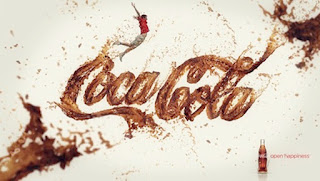
This poster design was highly creative, the playfulness of the text really gave it a great vibe and made it very clear as to what the product on hand was. CocaCola incorporated the signature 'CocaCola' text in such a strong manner and the idea of it being soda added such a great touch of originality. The colors that were used throughout the poster also added to the greatness of the image, the brand kept it  simple with the colors they decided to use; keeping it classic with the signature CocaCola red and of course using different shades of browns to add effects to the soda feature of the image. The white canvas also helped promote the simplicity of this design without making it boring, or washed out. Of course the man jumping around in the background could've stayed in his seat, but he too added to the 'playful' vibe the poster was giving off. Lastly, CocaCola finished off the image with a simple old school glass bottle of cola in the right hand corner keeping it classic, along with 'open happiness' their now branded slogan, which also ties in 'flying man' because he looks quite happy. The image design was amazing and got the message across in a creative way; drink a Coke and enjoy life - as simple as that. Well played Coke, very well played!


This poster for jam is absolutely adorable, and very playful. The text the company decided to use really added to the elements of the design. Although the designer decided to play it safe and keep it simple it benefited the overall turnout of the image, less is always more. The colors used for the text however did spice up the vibes in the poster, bright colors were used throughout the image and it really added to the 'easy like Sunday morning' energy it was trying giving off. The most captivating element of the entire image is the plate, it is so creative and really completed the design. It depicts a beautiful summer morning completed with sunshine, sun rays, a garden, butterflies, clouds and even your favorite breakfast in the shape of a fruit which happens to be a mango. This design is one of the most creative and really did a great job incorporating its product into the image. Jam isn't always one of the most desirable breakfasts' for a child however this playful ad might open up children's mind to want to try this yummy breakfast spread. Have breakfast with us and your day will follow up to be a great one, job well done!


This image is really intriguing and beautiful, at first glance the image may appear a bit spooky and strange but with further investigation it really works out to be a beautiful piece of art, and how ironic? It is actually an ad for The Art Institutes which was a great added element. Inside of the eye you can see a rainbow which is the focal point of the image and where most of the composition of color exists. Although more than three colors in a design can appear to be over powering this image was balanced very well because the background of the image is done in subtle grey and black. Inside of the eye you can see different artistic tools such as cooking utensils, drum sticks and paintbrushes and the pupil is made up of a camera lens; this part of the image was beyond creative and really sealed the deal on how art can really be such a beautiful thing. The text featured in the design was too very simple with a pop of color in the word 'ART' which also added to the importance of the topic at hand, keeping you focused on the major idea which is art. This image shows all of the aspects of art and how creative one can truly be in such a beautiful and graceful way.


This image incorporated text in such a cool way, it is an ad for Burger King which is quite impressive. The BK logo hidden there in the shadows really added to the great designs of the image, along with featuring a burger and a wrap showing that their menu is now more diverse than ever. The image features several different languages which also add to the creative factor and diversity of the design. The colors used in this image were very subtle yet sent the message across very well, keep it simple and keep it cute, GO BK! ;)
This image is so elegant and beautiful, the swan design is very creative and the eye in the center of the swan leads to some type of mystery in this case its a great thing because it is believed to be a movie poster a community in which mystery is very much welcomed. The colors were very well played, a black, red, grey and white also adds to the seriousness of the image and makes you wonder who could have been murdered. The colors were used in a creative gradient element which added to the creativity of the design. The text used was simple and swift adding to the gracefulness of the swan featured above. 


The Bad and Ugly: 


This poster can use some work, it is extremely difficult to read and once one finally focuses their eyes in on what it actually said the message throws you for a loop and goes against the entire theme of the image. Initially it appears to be a poster for maybe drinking and driving or perhaps a missed eye doctors appointment? However this image actually is a Valentine's Day poster, aside from the awkwardly placed red flower in the corner and the almost impossible to read message it gives no idea of the holiday. Of course keeping it simple in most designs adds to the greatness of it, this image missed that concept its one point was to send off a message and it struggled to complete that. As mentioned the red flower above is the only real added touch of color which also related to a doctors appointment. The message actually reads "You are the jelly to my peanut butter" which is really actually is cute, to incorporate this message in a more holiday oriented manner one could have used more color, better text placement and perhaps a jar of either peanut butter or jelly? This image appears to be an overall nightmare and reminded me to make a doctors appointment before the new year. 


This Heineken poster is straight to the point and very well designed.The vibrancy of the colors with the contrasts of the very black background brings out the infamous lime green and really captures the eye. However there was a downfall to this image, nothing was mentioned about it being an 'adult' beverage. Any child flipping through a simple sports illustrated magazine could've stopped at it and gained interests in it, making it look like a Mt. Dew ad. It is important when selling an object to make sure that objective is clear and clean-cut. Of course any beer drinker would be familiar with the green bottle, most people wouldn't realize what type of beverage it is until they went to purchase it. The text simply reads 'Freshness has a name' which would also add to the idea that it could be any type of refreshment, the colors really bring me back to a Mt. Dew ad. A simple 21+, or drink responsibly would add volumes to the image, and clarify exactly what the product being promoted is. As mentioned, this design was done very well along with the colors however the vague information added into the poster actually hurt the design. In this case, and very, very few others LESS IS NOT MORE!! Underage drinking is already a problem, we don't need to make it worse!

The poster doesn't appear to be in english, however it was interesting enough to study it anyways due to the intensity of the image. You are initially bombarded with a text overload, the image is using a Scientific Fantasy (SCFY) themed approach which must tie into the movie script someway however appears to be overused in the design. There are more than 4 different text styles used in the image and it makes it difficult to read, the eye can't focus in on the important elements of the poster because there are so many words jumping out at you. TEXT OVERLOAD! The colors used were a bit more subtle and that toned it down a bit and allowed for it to appear more creative, yet the images placed every where throughout the entire poster only adds to the text overload and makes this poster appear extremely heavy, crowded and immature. With a few minor changes the image could be a great piece of art, yet one can only help but to imagine how intense the film would actually work out to be if the creators felt that this poster did the movie any justice. Of course this is appears to be a science fiction movie so do any rules really apply!?
This design is very fun and playful and would do justice calling out a crowd for a night of fun, or 'boogie woogie' yet is a bit crowded and too 'cartoony' to be taken serious. If it were a design for a high school home coming maybe, but the text is so intense that its not clear as to what event is being promoted. 

Although the color scheme is beautiful it is a bit too much and makes it appear a bit immature, the text structure is clean and clear however this poster could use some added elements to spice it up. It almost appears as if a teenaged girl got ahold of Photoshop to create her Sweet-16 birthday bash flier.


Beauty is in the eye of the beholder but a bad design can be spotted by almost anyone. The designs here are very creative and speak for themselves where some could use minor work which could be as simple as placement or font type. When designing the number one rule to remember is LESS IS ALWAYS MORE!